- Published on
Adding multi theme support to Storybook and React
Storybook is a great tool to work on components in isolation and view all their possible states. If you're working on components that contain multiple themes (dark, light, high contrast, sepia, etc..), then Storybook is definitely the perfect tool to easily see your components in all these themes. In this tutorial, I'll show you how to provide theme support, be able to set them via globals and parameters, and how to leverage that to create a perfect snapshot experience with Chromatic.
Getting things ready
In the previous blog post, I explained in detail how to create a decorator to add support for whatever you need, using text direction as an example. I'll be using the same strategy, but for theming in the context of React applications, using jsx-styled based solutions. This will be more straight forward, so please refer to the previous tutorial if you want the details.
Creating the themes
In this recipe, we'll be creating a decorator for emotion based themes. This should work perfectly for any jsx-styled based solution, you just have to change the syntax a little bit.
Let's create 5 themes for our application in a themes.js file:
Creating a themed component
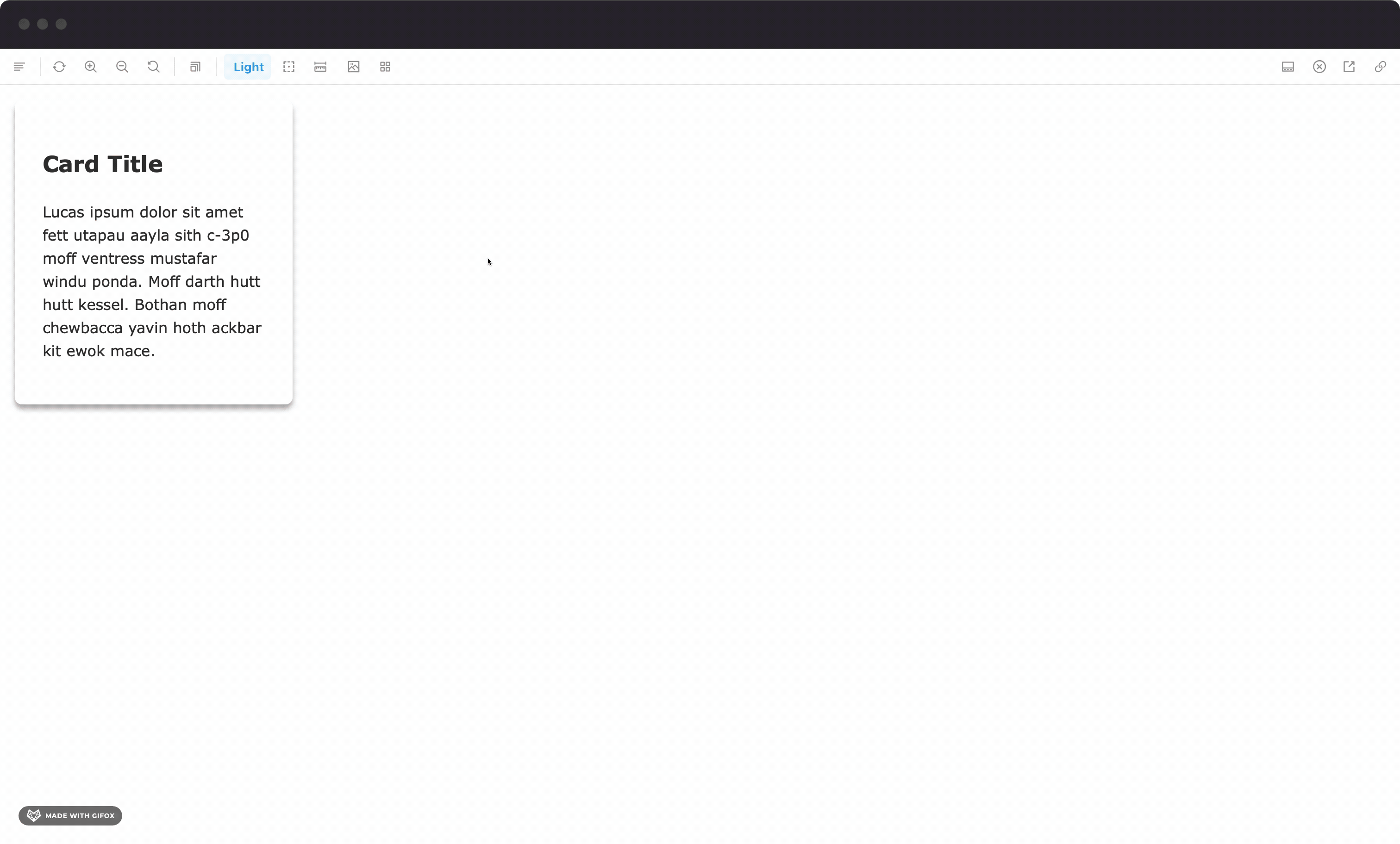
Let's use a Card component to showcase the themes. It leverages the themes and the useTheme hook from emotion to display different text and background colors, based on different themes. Let's also create the stories file for that component:
Once we open the story in Storybook, the component throws an error:
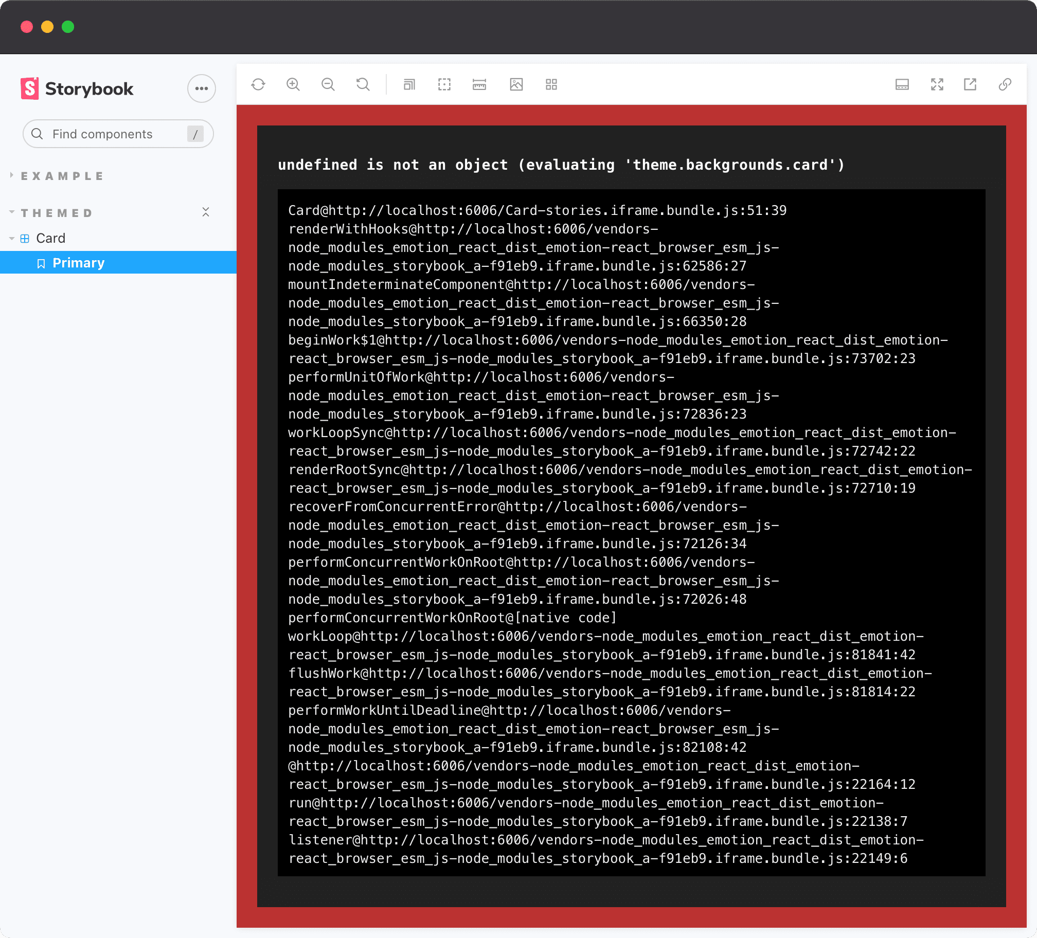
That makes sense. As the component renders in isolation, it needs to be wrapped in a ThemeProvider from emotion, so that the useTheme hook works. Normally in an application, that is available higher in the tree, like in App.jsx. In Storybook, however, that should be provided via a decorator.
Creating the theme decorator
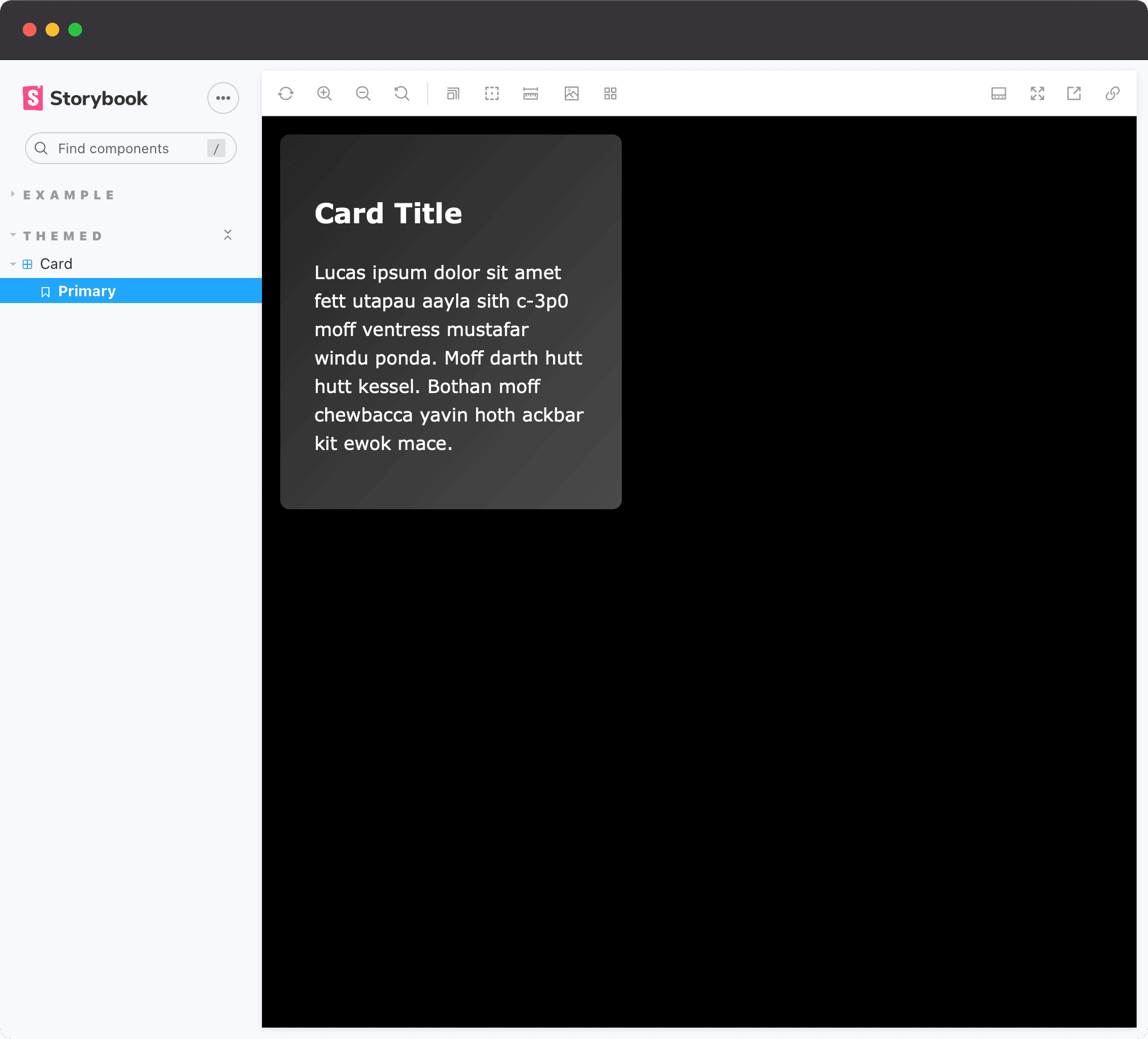
The first step is to add support for themes in Storybook. Let's start simple and create a withTheme decorator which wraps the story in a ThemeProvider passing a hardcoded dark theme, and also overrides the styles of body to use the app background color:
Now the story does not error anymore, and looks pretty good:
Creating a toolbar button to switch themes
Awesome. Now it's time to add the toolbars. Let's add globalTypes to the .storybook/preview.js file:
Updating the decorator to use globals and parameters
Let's define the API for the parameters, which should be pretty simple:
export const MyStory = { parameters: { // Any of these options. If none are provided, the default is used (light) theme: 'light' | 'dark' | 'acqua' | 'fira' | 'terra', 'side-by-side' | 'stacked', }}
And now you can update the decorator to get the values from either parameters or globals, rather than a hardcoded theme:
Now you can play around with the newly added theme toolbar button, which already gives an amazing experience. The last two options (side-by-side and stacked) don't work yet, we'll get there soon.
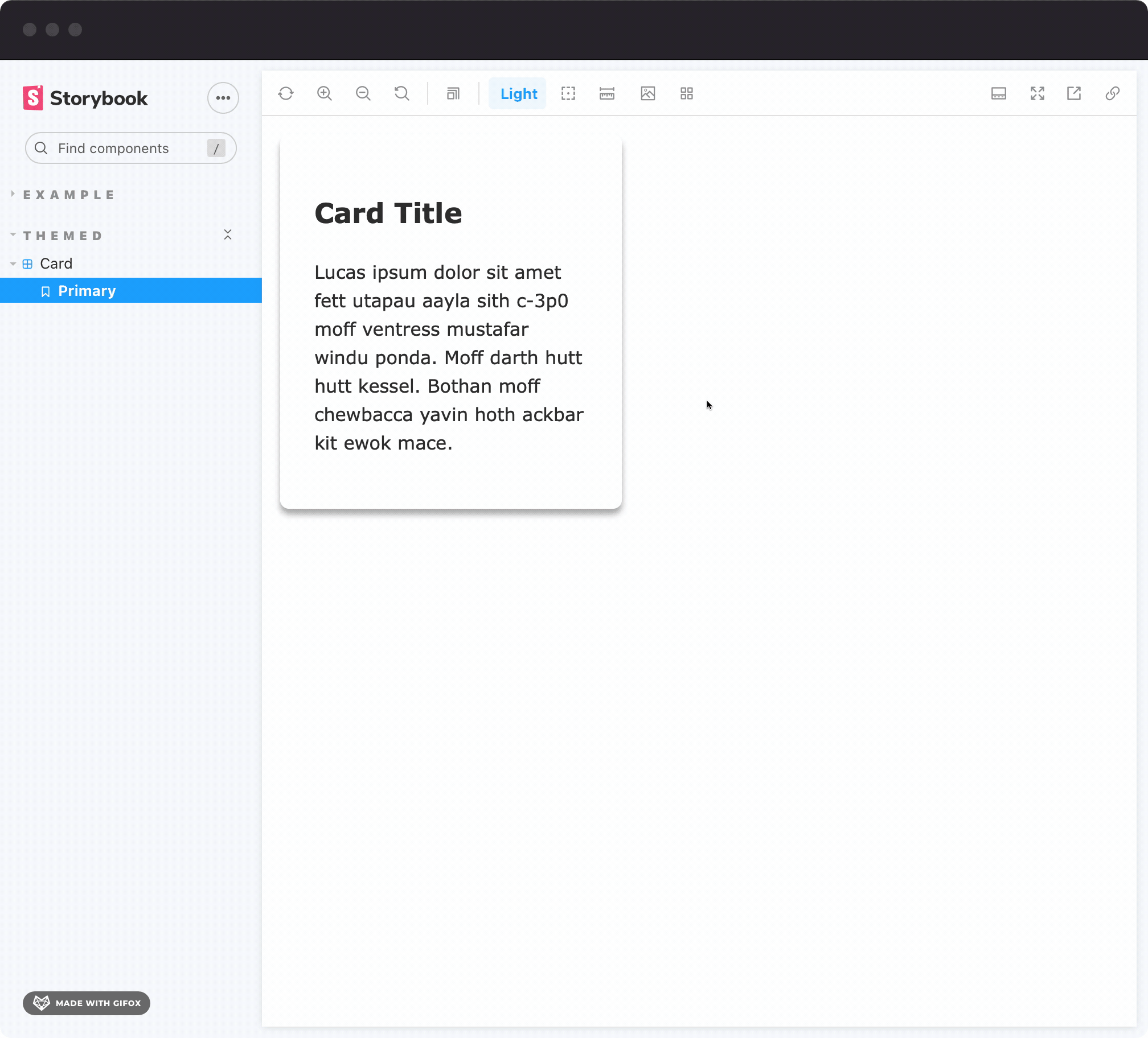
You can also set specific themes to stories by using the theme parameter.
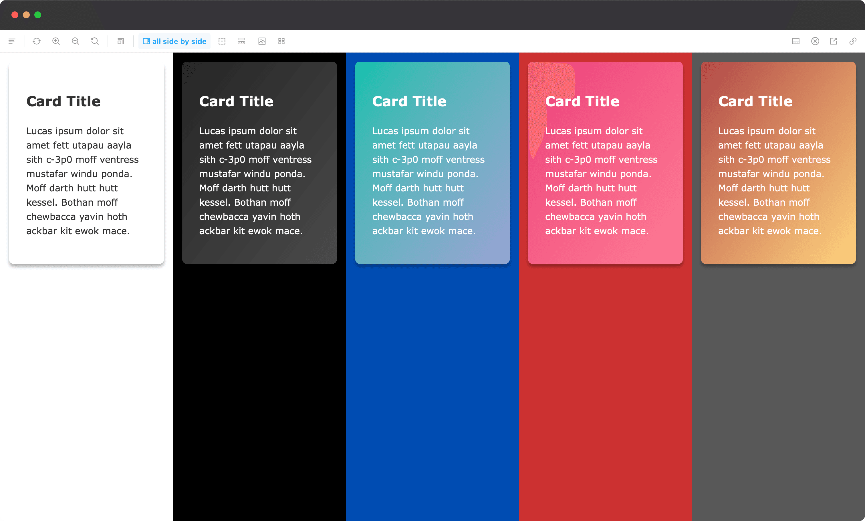
Seeing multiple themes at the same time
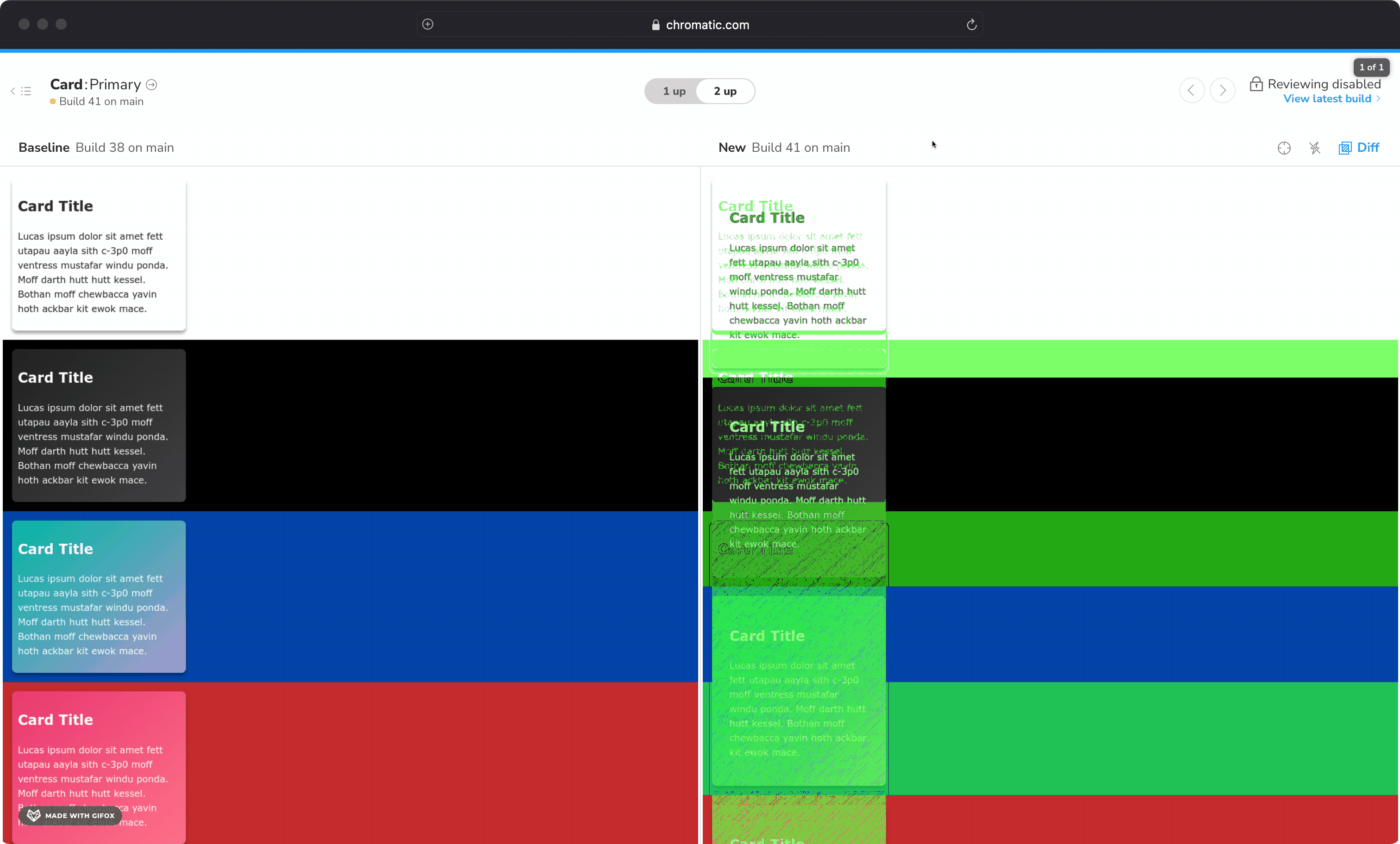
To make things even beter, let's change the withTheme decorator to add a side-by-side/stacked view, where it iterates over every available theme and renders them together inside of a grid:
Now you get a very insightful experience, being able to compare different themes side by side. The stacked mode is great for larger components, such as pages, so that you don't end up squeezing the content too much.
Leveraging Chromatic for snapshot testing
Now that you have the right tools to render a component in multiple themes, you can easily snapshot all of them with Chromatic! There are a couple of ways to do so:
- You can add a parameter to your story that will render the component in all themes like so:
- You can change the
defaultThemein the decorator logic by leveraging the isChromatic helper, which will return true only when Chromatic is capturing a snapshot. This way every component you have will render in a default theme in Storybook, but will have its snapshot taken in all themes at the same time in Chromatic:
⚠️ It's very tricky to do things like that globally, which could be problematic if you have components that have absolute positioning or use the play function, so be aware. You can always set this to apply to every story, but pass
parameters.themeto a story that should not display in stacked mode by default in Chromatic.
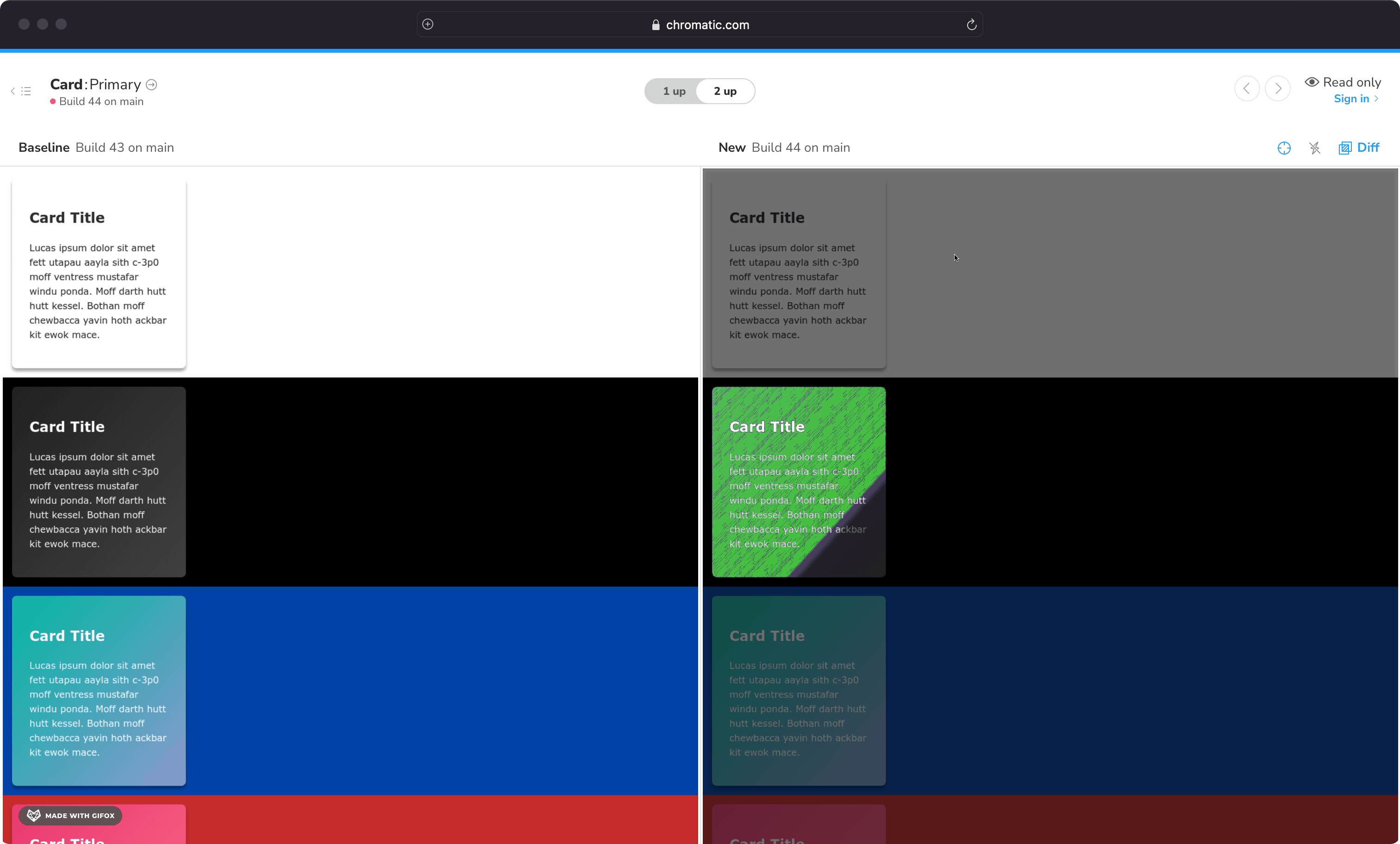
Once you do either of these, and eventually make changes to your component, Chromatic will pick them up you can see how they are reflected in all theme variants. This is really important because you might make a change that impacts all themes, like so:
But you can also make a change that only impacts a single theme, which could easily go unnoticed. Here's an example of a change in dark theme, of which Chromatic detected and notified:
Final result
You can find the code for the decorator in this repo, and here's a live embed so you can play around with the real thing:
Conclusion
Thanks for reading!
When thinking about working with multiple teams, designers, etc. It's quite easy to just keep pushing changes without realizing the impact of them. Combining the power of Storybook and Chromatic is a great companion to give your team better opportunities for collaboration but also confidence when changing your code, making sure you don't end up with visual regressions!