- Published on
Creating an addon-like experience in Storybook using parameters and globals
Whenever using Storybook, you might face a situation where you want to support certain functionality for your stories, such as internationalization, theming, right to left mode etc.
In such situations, developers normally go for Storybook addons, which are tools that can be installed to enhance the development experience in Storybook, or add support for certain functionalities. They can normally be activated via parameters like so:
Or they might introduce a new button in the toolbar which can be changed at runtime:
Some addons are maintained by the Storybook core team, but most are created and maintained by the community. They're great! But sometimes either your use case is rather specific and you can't find addons for that, or you simply don't want to depend on a third-party addon.
If that's the case, you could probably create an addon of your own.
Creating an addon might be too much for me
Storybook has great tutorials, including one that shows you how to create a Storybook addon. However, this involves understanding more about Storybook's internals APIs, how to register addons, create presets, handle the addon panel if necessary, etc.
If you do create your own addon, that's awesome because you can do so much with it. Even better, you can make it public and end up helping many developers in a similar situation! In fact, Storybook provides a template for you to create addons with, called addon-kit.
But.. sometimes your scenario is so simple that you don't want to go through all of that.
Thankfully, Storybook has a few concepts that we can use to create an addon-like experience, without actually creating an addon:
- Decorators
- Story context
- Parameters
- Globals
The use case
To illustrate the concepts clearly, I'll be showing you how to create an addon-like experience to provide RTL (right to left) mode to your stories. You can then use this knowledge to build pretty much anything else you want.
💡 RTL (Right To Left) is a locale property indicating that text is written from right to left. It's common in languages like Arabic and Hebrew.
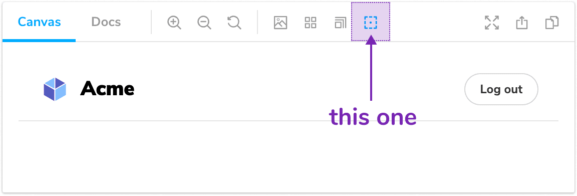
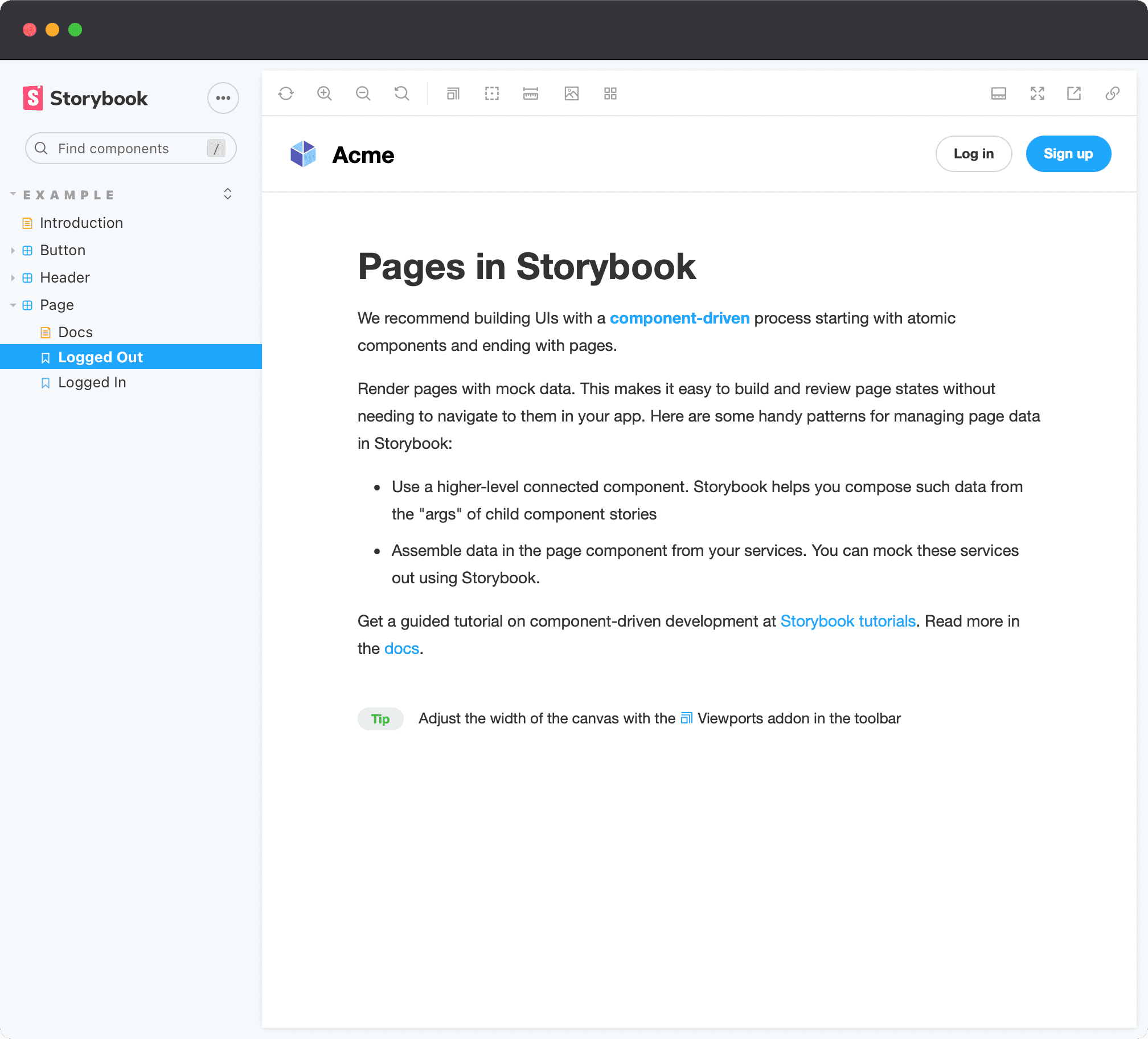
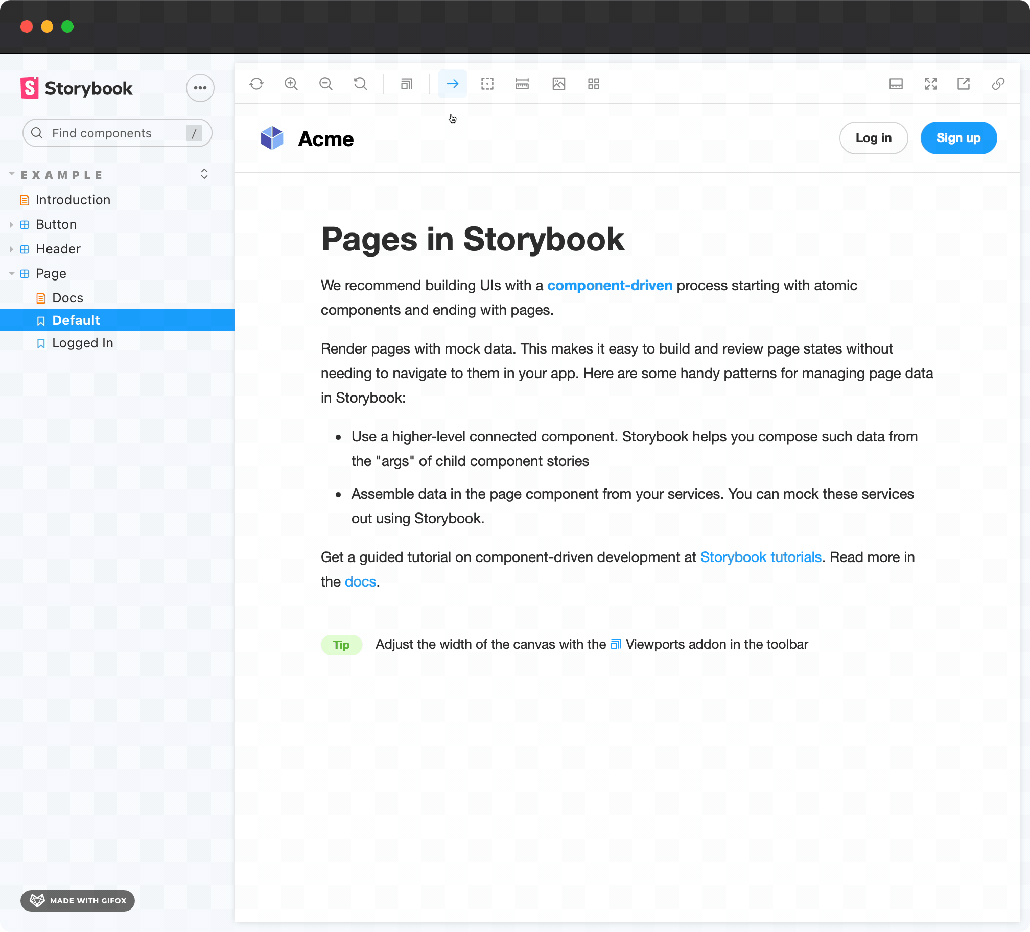
I'll be using the Page story as example, which comes from the boilerplate that Storybook generates when first installed:
Alright, let's get to it.
Storybook decorators
If you have been using Storybook for a while, you most probably have used or created decorators. Decorators are basically wrappers that receive a Story component and enhance it in a certain way. They are used to either provide visual enhancements or functionality (e.g. theming, state management, etc.).
Here's an example of a simple decorator for RTL mode. It wraps the story in a <div> element adding dir="rtl" to it:
⚠️ If you don't use React, I got you covered. Keep reading and at the end I'll show you how to achieve the same thing in a different way.
And here's how it looks like:
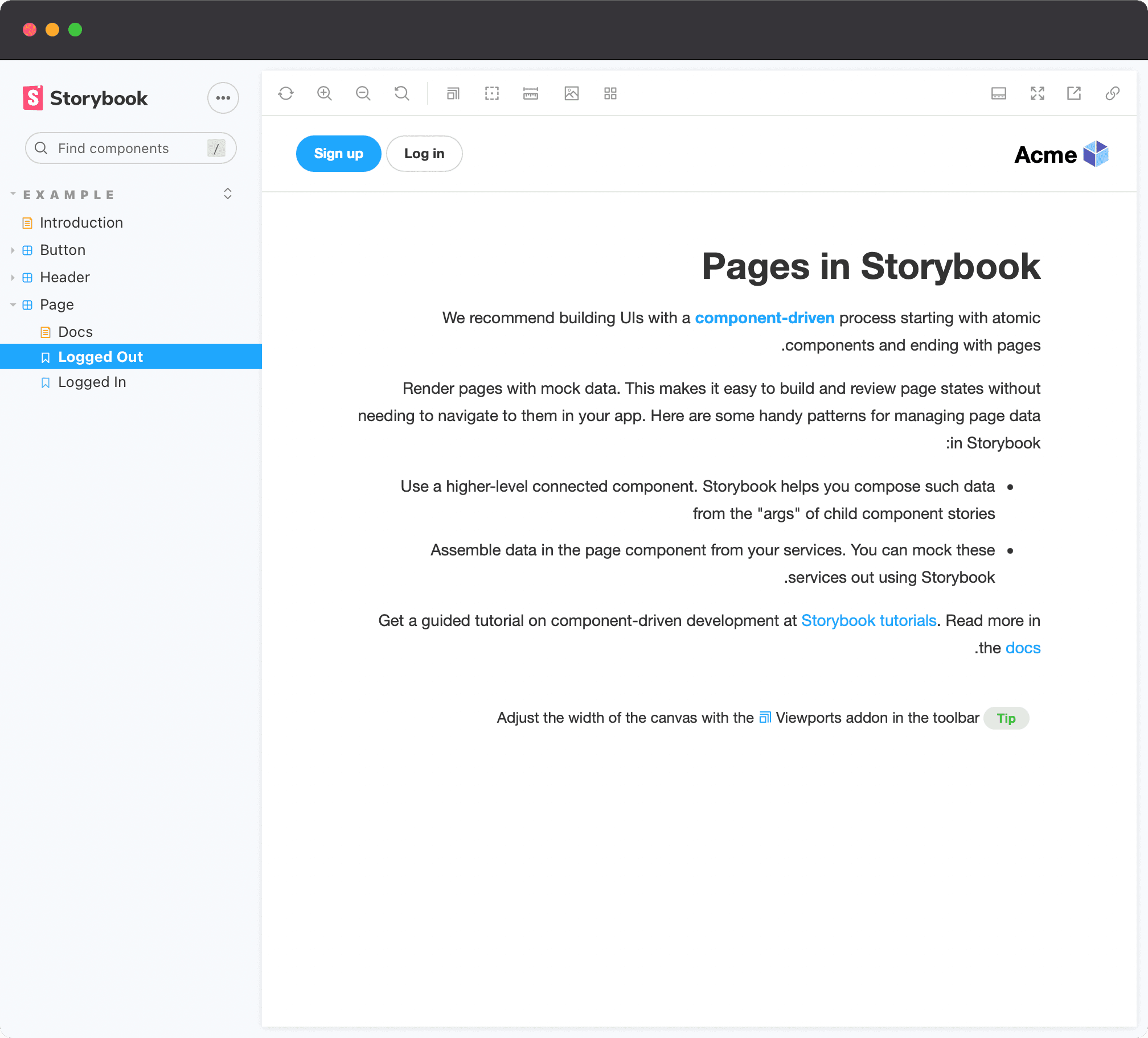
The decorator might be great for a specific story, but what if you want to make this scalable? You probably don't want to repeat the same code in every file. Thanks to the way data is inherited in Storybook, you can move the decorator up to .storybook/preview.js and make it global, so it applies to every single story:
But then, every story will be in RTL mode. You might want to create a way to opt-out of this behavior. Or even, to opt-in, depending on what you're trying to achieve.
So what do you do now? There should be a way to define some metadata from a story, so you can decide whether or not to apply the decorator. Thankfully, decorators not only receive the story function as an argument, but also the story context, which will provide exactly what we need.
Exploring the story context
The context is an object that contains contextual data that is necessary for a story to function correctly. It pretty much defines what a story is made of: id, name, args, parameters, globals, and more.
If we update the decorator to access and log the context, like so:
We get the following output:
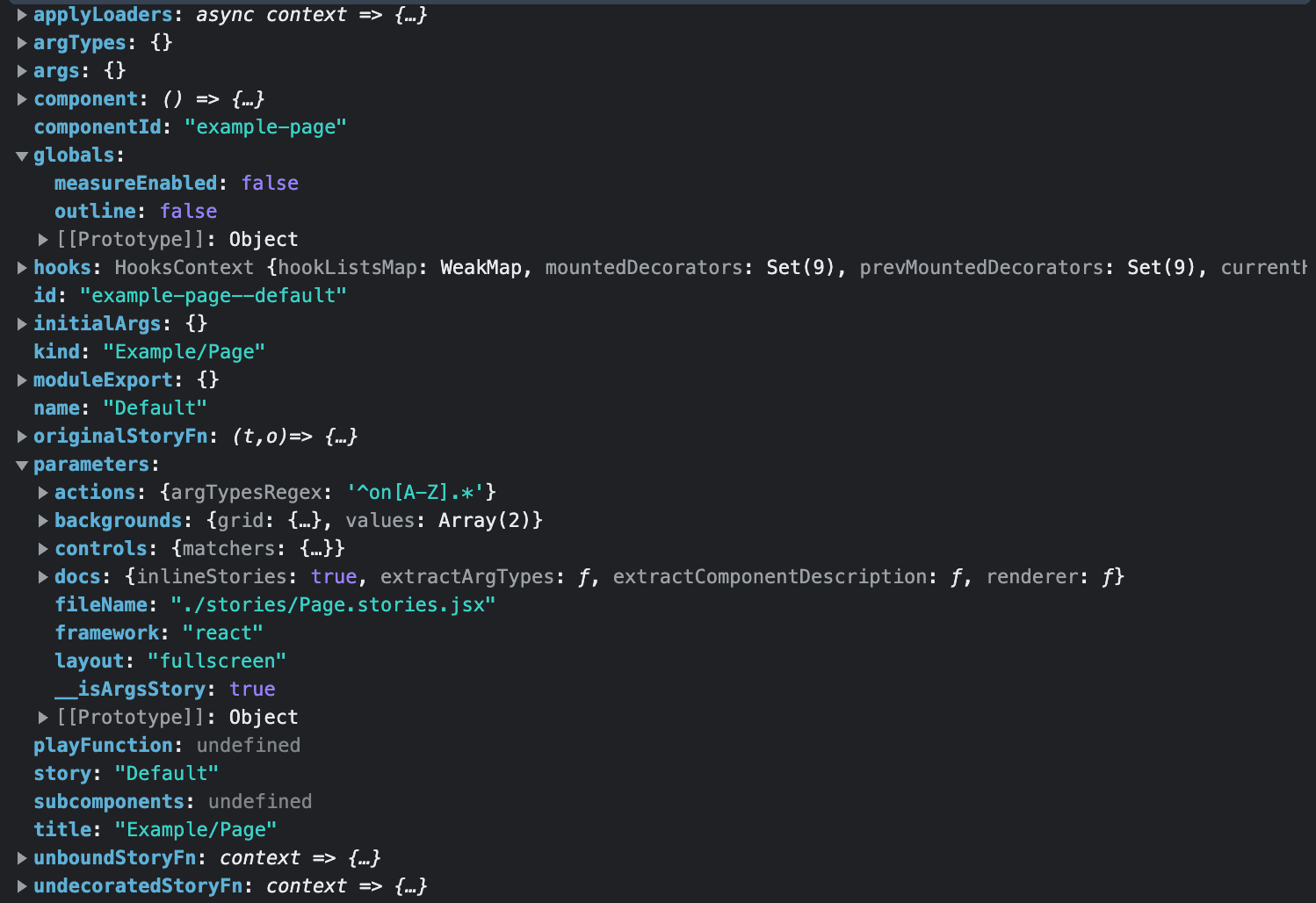
What stands out from there are globals and parameters. Having access to such data in a decorator gives a lot of possibilities for creating a custom API to do whatever you like. Let's understand why.
Story parameters
Story parameters are a way to pass metadata to a story. They are normally used to define the behavior of some Storybook features or Storybook addons. However, you can also use parameters to pass any arbitrary data, which will make its way to the story context.
We can create our own API to communicate with the withRTL decorator, allowing users to opt-in to it, for example:
export const Default = { parameters: { // opt-in to RTL mode for this story textDirection: 'rtl', },}
We can modify the withRTL decorator code to extract the parameters property from the story context, and make the decorator only apply the RTL mode if the story contains parameters.textDirection: "rtl":
And the story code then becomes:
As a result, we retain the same experience as before, but now it can be enabled by simply defining a parameter, just like how you communicate with some addons you use (e.g. viewports, backgrounds).
This is a great way to enable/disable certain decorator states for a component. However, this is slightly limited because it can only happen in code, which means if you want to change the setting, you need to update the code.
If you wanted a way to change the decorator state at runtime, Storybook has a global state that can be used, and that is also part of the story context.
Storybook globals
Storybook has a global state that stores data which is used by addons, and gets persisted across stories. Such data is also available in the story context.
If you're using addon-essentials (most Storybook projects use it nowadays), you can create custom toolbars for your project, which will add data to the global state of Storybook, and change it as you interact with your newly created toolbar. We can leverage this to create a runtime experience that allows users to switch from LTR to RTL in any story they want, just by clicking on a button.
Creating a custom toolbar with addon-toolbars
In order to create a toolbar item of our own, we can follow the documentation here and export a globalTypes object in .storybook/preview.js:
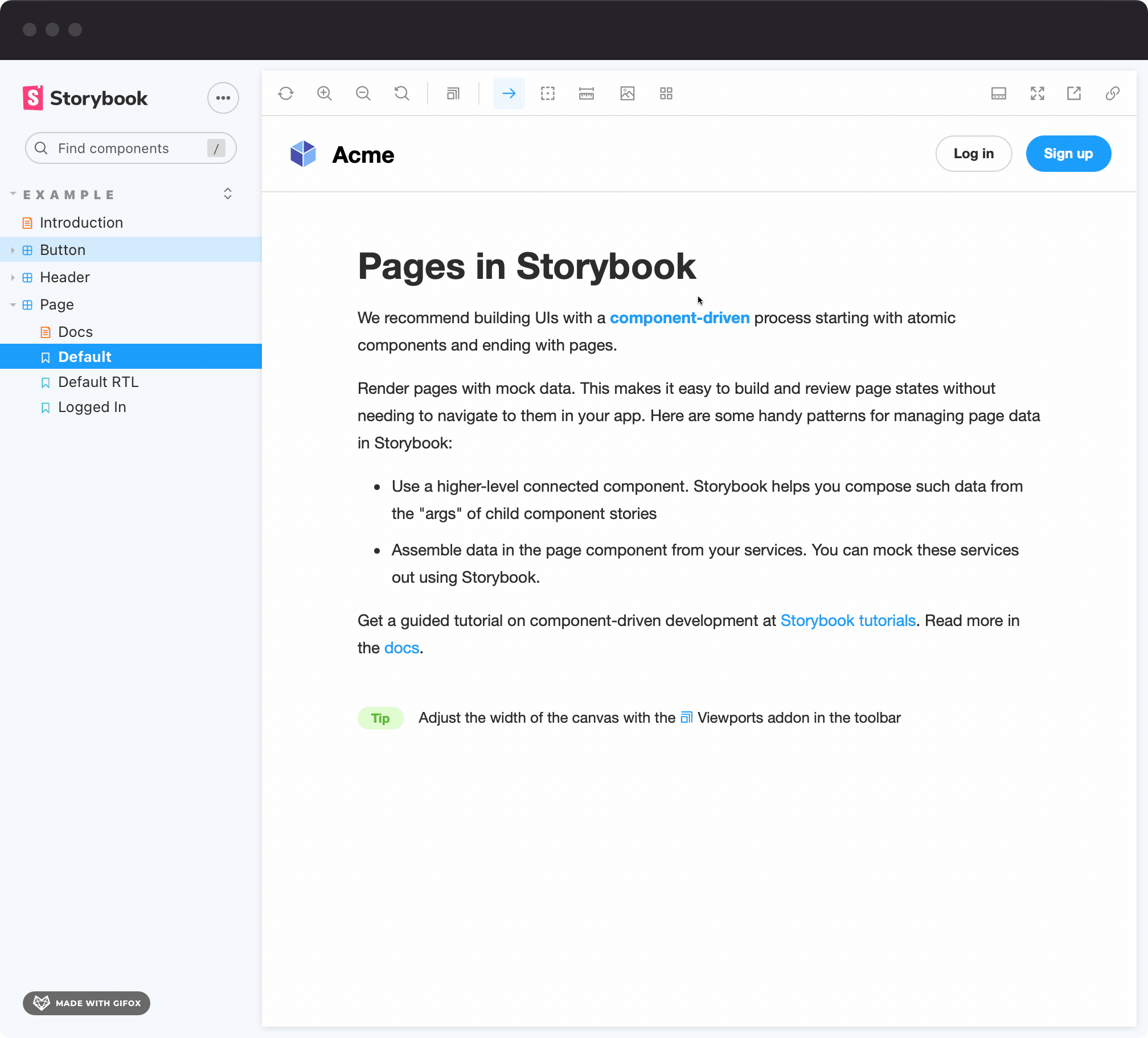
Now when checking Storybook, we see that there is a new button in the toolbar:
As we interact with it, nothing really happens. That makes sense! We didn't wire our decorator to use those global values yet. Let's do that.
Setting the text direction via globals
Looking back at the withRTL decorator, we can now extract globals from the context, which should contain the textDirection property that we defined via globalTypes. The component will re-render every time the globals change, and we can check whether the value is rtl or ltr to opt-in to the different modes. We should still support the parameter we created, and it should respect it as higher priority than the global state:
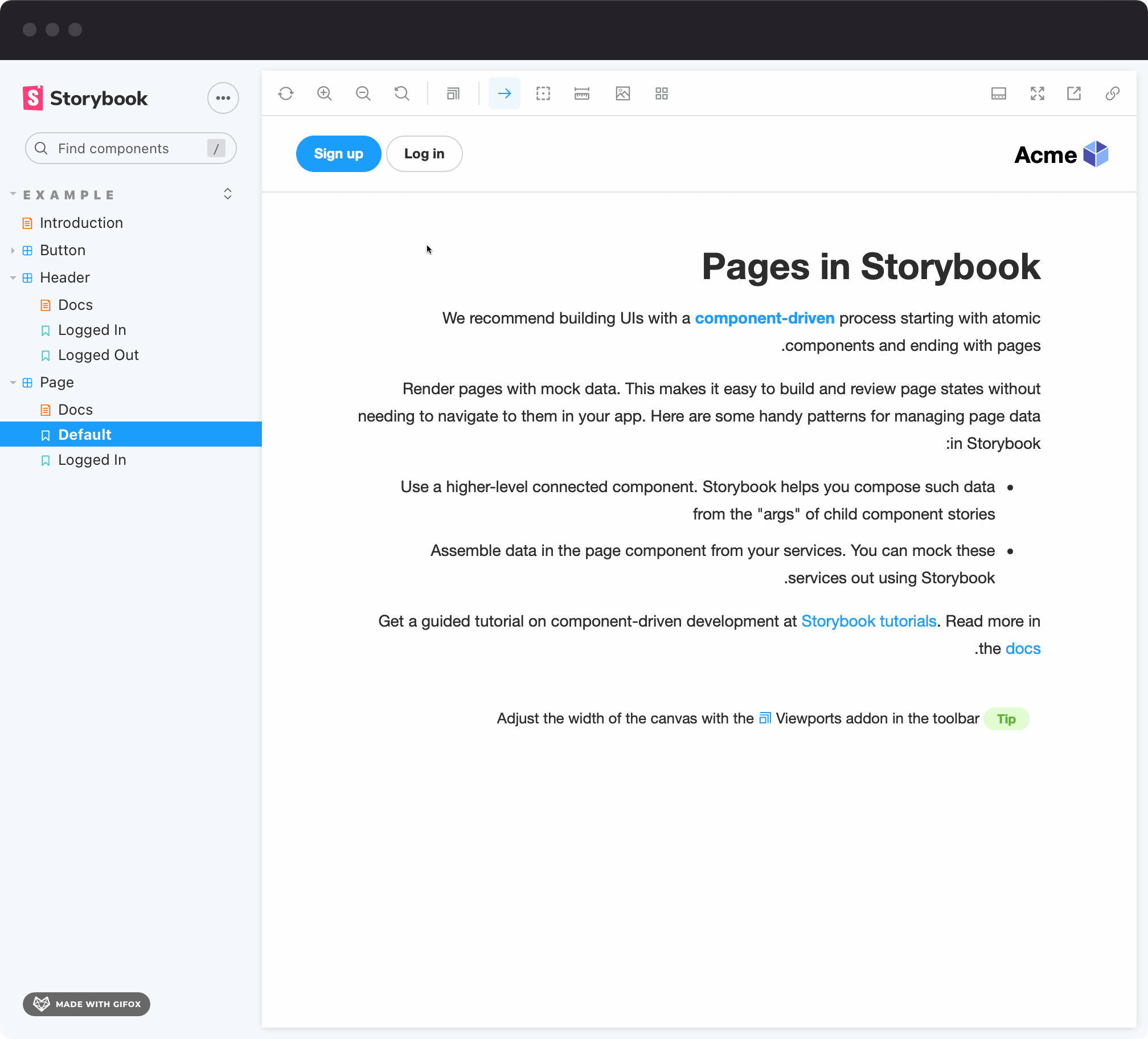
Now we can successfully change the theme without having to make any code changes! And because we are respecting the parameters defined in the Default story, the globals won't do anything. However, when going to any other story, we are able to toggle the reading modes:
This is great because you probably want stories that will always represent certain state (e.g. RTL, dark mode, etc.), but you want the flexibility to experiment freely in other stories.
The best of both worlds
Now that we have a way to change the reading mode both via parameters and globals, we should probably create a new story for the RTL mode, and leave the Default story without parameters:
As a result, we can toggle the RTL mode in other stories at runtime by using the toolbar, but we have an explicit story for the RTL mode which will always have it activated. This makes it easier to understand what the story represents, and it also makes it easier to test. Plus, if you're using tools like Chromatic for visual regression testing, you will make sure that you're testing what matters.
Applying the decorator logic for non-React projects
This all sounds super nice, but what if I'm using Storybook with Angular, where I can't wrap components with JSX? Or what if I don't want to change markup, but execute something programmatically?
Thankfully, changing reading mode can also be done programmatically via the document.body.dir property. Storybook's @storybook/client-api package provides react-like hooks that can be used in any framework (Angular, Vue, Svelte, etc.), and we can use the useEffect hook to apply the reading direction once the component renders:
Bonus: Rendering both modes at the same time
Sometimes you want to visualize things side by side (or stacked on each other), so they're easy to compare or visualize. To make things even more interesting, we can leverage the use of decorators to render the same story twice, in a grid, and apply the necessary styles to position them as we want.
First, we add new options to globalTypes, called "side-by-side" and "stacked".
Then, we update the decorator to account the newly added scenarios, rendering the story twice inside of a grid:
When selecting the new option in the toolbar, we are able to see both the RTL and the LTR version of the story:
Bonus 2: Adding keyboard shortcuts
The addon-toolbars provides a way to set keyboard shortcuts via the toolbar.shortcuts property for switching to the next/previous value, or resetting its state. Shortcuts improve both user experience and productivity, so it's pretty cool to know you can achieve that.
Now try it out, it's pretty neat being able to switch modes very quickly. This could work really well for theme switching, for instance.
💡 You can check all possible shortcut values in this file.
Bonus 3: Taking snapshots with Chromatic
If you're using a visual regression testing tool like Chromatic, you can change the default reading mode in the decorator from lrt to side-by-side or stacked when the story is rendered via Chromatic. This way, you can visualize stories the normal way when accessing Storybook, and have snapshots taken for each and every story in both modes at the same time in Chromatic. Chromatic provides an isChromatic utility to help with that!
We can then update the decorator:
And if you don't want to do this for all stories but rather per-story basis, you could use the isChromatic helper in a story parameter:
💡 While this example uses reading modes, it can be used in conjunction with anything your creativity allows, in fact it works perfectly with multi-theming
Final result
You can find the code for the decorator in this repo, and here's a live embed so you can play around with the real thing:
Conclusion
Thank you so much for reading this through. You just learned how to combine the power of small concepts to achieve something greater. This tutorial was using reading modes as a use case, but you can use this knowledge potentially for solutions such as:
- Internationalization
- Dual Theming
- Multi Theming
- State management
- Routing
- etc.
The possibilities are endless, and the best way to learn is to try it out. Keep this in your toolbelt, I'm sure it will be very useful to you.
I hope you enjoyed it, and if you have any questions, feel free to reach out on Twitter. If you want to know more about the potential of Storybook and how to use it effectively in React projects, I created a course that goes from the basics to complex features, with lots of pro tips in between!